


Color is one of the most powerful elements in web design. It influences how users perceive your brand, impacts readability, and affects decision-making. A well-chosen color scheme strengthens your identity and improves usability, while poor choices can drive visitors away. In this blog, we’ll explore how to choose the right color scheme for your website using proven principles and design tools.
1. Understand Your Brand Identity First
Before picking colors, clarify what your brand represents. Are you modern and bold, or classic and refined? Colors should reflect your brand’s voice and values. For example, tech companies often use blue for trust and professionalism, while wellness brands prefer calming greens and neutrals. Your website’s color scheme must visually communicate your brand essence.
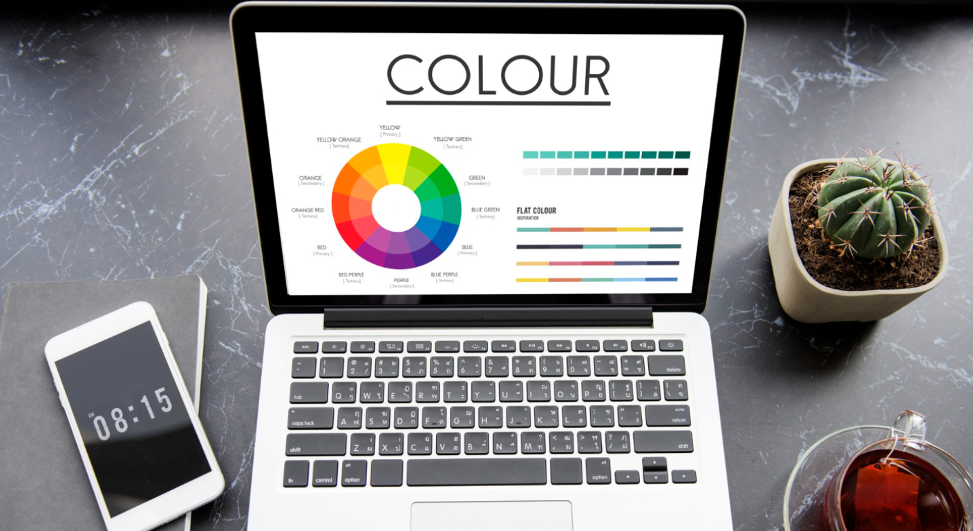
2. Learn the Basics of Color Theory
Color theory helps designers create balanced and harmonious palettes. Understand primary, secondary, and tertiary colors, as well as concepts like complementary, analogous, and triadic schemes. A good understanding of color relationships enables you to design with intent rather than guesswork, resulting in visually pleasing combinations that work well together.
3. Use the 60–30–10 Rule
A popular guideline in design, the 60–30–10 rule helps you distribute colors effectively. Use 60% of your dominant color (often background), 30% of a secondary color (used in headers or sections), and 10% for an accent color (calls to action, buttons). This rule ensures balance while highlighting important elements naturally.
4. Consider Color Psychology
Colors evoke emotions and influence decisions. For instance, red can imply urgency or excitement, blue evokes trust, green signals health, and black denotes luxury. Think about how your colors will make visitors feel and what actions you want them to take. Align color choices with your content and goals.
5. Test for Accessibility and Contrast
Accessibility is essential in web design. Make sure your color scheme provides enough contrast between text and background. Tools like WebAIM and Contrast Checker help validate your color pairings. High contrast improves readability for all users, including those with visual impairments, and ensures your site is inclusive.
6. Choose a Color Palette Tool
Tools like Adobe Color, Coolors, and Paletton can generate attractive color schemes based on your preferences. These platforms offer palette suggestions using color theory principles and allow real-time customization. Use them to explore combinations and export color codes directly into your design files or CSS.
7. Draw Inspiration from Nature and Art
Sometimes the best color ideas come from the real world. Study nature, fashion, architecture, or paintings to observe harmonious color pairings. Nature offers amazing combinations—sunsets, forests, or oceans provide color inspiration with built-in contrast and flow that can be applied to digital layouts.
8. Use Colors Consistently Across All Pages
Color consistency reinforces your brand and improves user navigation. Define your brand colors in a style guide and apply them consistently to headings, buttons, links, and icons. Avoid using too many new colors from page to page—it creates visual noise and disrupts user focus.
9. Tailor Color Choices for Your Audience
Your color palette should align with your target demographic. Younger audiences may prefer bold and vibrant colors, while older users favor more subdued and readable tones. Cultural preferences also play a role—colors can mean different things in different regions, so always consider the audience context.
10. A/B Test Your Color Decisions
Sometimes, what looks good in theory doesn’t perform well in practice. Use A/B testing to experiment with different color versions of buttons, headlines, or CTAs. Analyze conversion rates, click-throughs, and user behavior to determine which color choices are more effective in real-world scenarios.
Conclusion
Choosing the right color scheme is a strategic design decision that affects branding, usability, and engagement. By understanding your audience, using color theory, and testing for accessibility and performance, you can create color palettes that not only look great but also help your website achieve its goals.