
What Is a Mobile-First Website?
A mobile-first website is a website designed primarily around the needs of smartphone users before expanding the experience for tablets, laptops and desktop computers.
Traditional website development often started with the desktop version.
Designers would create a large-screen layout first and then adjust it for smaller screens.
Mobile-first design takes the opposite approach.
The design starts with the smallest practical screen and focuses on the most important content, navigation and actions. The experience can then progressively expand for larger screens.
This does not mean that a mobile-first website is designed only for mobile phones.
Instead, it means that mobile users are considered a primary audience from the beginning of the design and development process.
For example, a business website might prioritize:
- Easy-to-read content
- Simple navigation
- Fast loading
- Touch-friendly buttons
- Shorter forms
- Clear calls to action
- Optimized images
- Responsive layouts
- Easy access to phone and WhatsApp
The desktop version can then provide additional space for more detailed layouts, larger images, expanded navigation and other elements.
Mobile-First vs Mobile-Friendly
These terms are related but not identical.
A mobile-friendly website generally means the existing website works properly on smartphones.
A mobile-first website means the mobile experience was considered as a fundamental part of the design strategy from the beginning.
For businesses, this distinction matters because simply shrinking a desktop website does not necessarily create a good mobile experience.
A successful mobile-first website considers how users actually browse, search, read, interact and convert on smaller screens.
Why Is Mobile-First Web Design Important for Businesses?
A website is often one of the first digital touchpoints between a business and a potential customer.
If that experience is difficult on mobile, the business may lose opportunities before the visitor even understands what it offers.
Mobile-first web design is important because smartphone users have different requirements from desktop users.
A person using a smartphone may be:
- Searching while travelling
- Comparing businesses
- Looking for a phone number
- Checking a service
- Reading reviews
- Looking for directions
- Requesting a quote
- Purchasing a product
These users usually want information quickly.
A mobile-first website therefore needs to remove unnecessary friction.
Key Benefits of Mobile-First Design
- Better mobile usability
- Simpler navigation
- Faster access to important information
- Improved user experience
- Better support for mobile SEO
- Potentially stronger conversion journeys
- Better performance on smaller screens
- More consistent responsive design
- Improved accessibility
- Better preparation for future devices
Mobile-first design is especially relevant for businesses that receive substantial traffic from smartphones.
Mobile-First Website vs Responsive Website: What Is the Difference?
Mobile-first design and responsive web design are often discussed together, but they describe different aspects of website development.
Responsive web design refers to a website’s ability to adapt its layout and content to different screen sizes.
A responsive website can work across:
- Smartphones
- Tablets
- Laptops
- Desktop monitors
- Large displays
The layout can automatically adjust according to the available screen space.
Mobile-first design, on the other hand, describes the design approach.
The website is planned around smaller screens first and then expanded for larger devices.
Example
- Wide navigation
- Large hero image
- Three-column service cards
- Testimonials displayed in rows
- Multiple content blocks
- Large footer navigation
Responsive design is therefore an important technical component, while mobile-first is a broader design and development strategy.
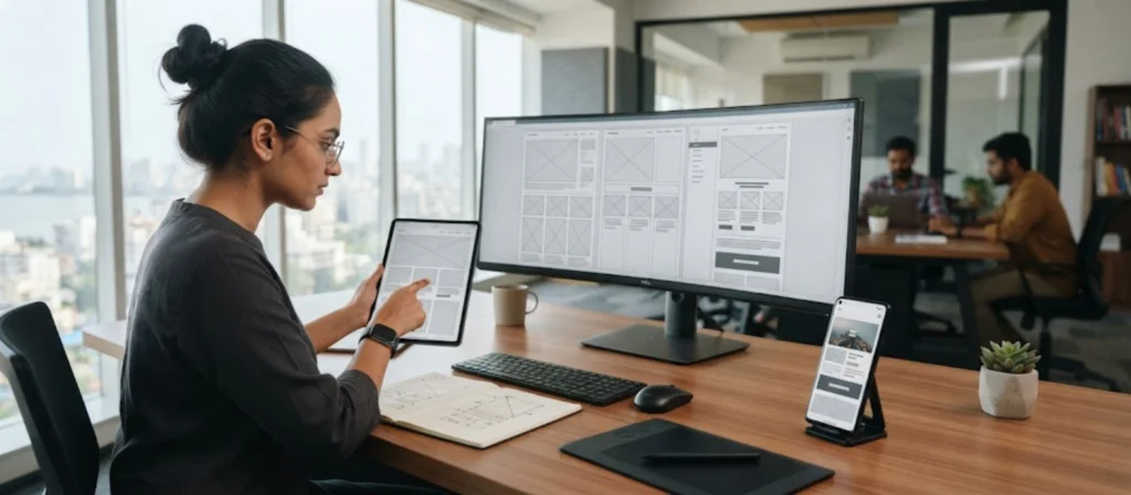
How Does a Mobile-First Website Improve User Experience?
User experience, or UX, describes how easily and comfortably people can use a website.
A mobile-first website can improve UX by removing unnecessary complexity.
Consider the difference between these two experiences.
Poor Mobile Experience
A visitor opens a website and sees:
- A large desktop-style menu
- Huge image files
- Tiny text
- Multiple pop-ups
- Difficult forms
- Small buttons
The visitor has to work to use the website.
Better Mobile Experience
The visitor sees:
- A clear navigation menu
- Short and useful content
- Fast-loading images
- Readable typography
- Easy-to-tap buttons
- Simple forms
The website helps the visitor complete their task.
Four Important Areas of Mobile UX
1. Navigation
Users should quickly understand where they are and where they can go.
2. Content
Important information should appear without unnecessary scrolling.
3. Interaction
Buttons, forms, menus and links should be easy to use.
4. Feedback
Users should understand what happens after they tap, submit or complete an action.
For example, after submitting a contact form, the user should receive a clear confirmation.
Good UX is not about adding more design elements.
It is often about removing unnecessary friction.
Mobile-First Websites Can Support Better SEO
Mobile-first website design and SEO are closely connected.
Search engines need to crawl, understand and evaluate website content effectively.
Google has moved to mobile-first indexing for websites, meaning the mobile version of a site’s content is generally used for indexing and ranking.
This makes it important for businesses to ensure that the mobile version contains the important content and structured information available on the desktop version.
A mobile-first website can support SEO through:
- Responsive design
- Consistent content
- Good mobile usability
- Fast performance
- Clear headings
- Logical navigation
- Internal linking
- Accessible content
However, mobile-first design should not be treated as an SEO shortcut.
Simply making a website responsive does not automatically result in higher rankings.
Mobile-First Design and Website Speed
Website performance is particularly important on mobile devices.
Smartphones may operate on different network conditions, hardware capabilities and environments.
A visitor could be browsing through:
- Mobile data
- Public Wi-Fi
- Home Wi-Fi
- 4G
- 5G
- Slower connections
A website that loads quickly on a high-end office computer may not provide the same experience on every smartphone.
Mobile-first website development therefore encourages teams to think carefully about performance from the beginning.
Ways to Improve Mobile Website Speed
Optimize Images
Use appropriately sized images and modern formats where suitable.
Reduce Unnecessary Scripts
Remove code and third-party resources that do not provide meaningful value.
Use Efficient Fonts
Avoid loading unnecessary font variations.
Optimize Videos
Do not automatically load large video files when they are not required.
Use Caching
Caching can reduce repeated server processing and resource loading.
Choose Appropriate Hosting
Hosting infrastructure can influence website performance.
Minimize Heavy Effects
Excessive animations and visual effects can increase resource requirements.
Optimize Code
Clean and efficient HTML, CSS and JavaScript can contribute to better performance.
Google’s Core Web Vitals provide important user-focused performance measurements, including loading performance, responsiveness and visual stability.
For businesses, the objective should be more than achieving a technical score.
The website should feel fast and responsive for real users.
How Mobile-First Design Can Improve Lead Generation
A business website should not simply provide information.
For many businesses, it should also help generate enquiries.
Mobile-first design can support lead generation by making conversion actions easier to complete.
For example, a potential customer may search for a service from their smartphone.
They should be able to quickly:
Understand the service → Build trust → Take action
That action could be:
- Call the business
- Send a WhatsApp message
- Submit an enquiry
- Request a quotation
- Book an appointment
- Download a resource
- Schedule a consultation
Mobile Lead Generation Best Practices
- Use clear calls to action
- Keep enquiry forms short
- Make phone numbers clickable
- Make WhatsApp links easy to access
- Show important contact information clearly
- Use readable service descriptions
- Display testimonials and trust signals
- Reduce unnecessary form fields
- Keep landing pages focused
- Provide clear confirmation after form submission
A mobile-first website should consider the entire conversion journey.
For example:
Google Search → Mobile Landing Page → Service Benefits → Reviews → CTA → Enquiry
If any step creates unnecessary friction, potential leads may be lost.
Do Not Overload the User
Mobile conversion design should not mean adding buttons everywhere.
Too many:
- Pop-ups
- Sticky bars
- Notifications
- Chat widgets
- CTAs
can make the experience frustrating.
The objective is to make the next useful action clear, not overwhelming.

Mobile-First E-commerce Websites and Online Shopping
For e-commerce businesses, mobile-first design can be especially important.
Customers may discover products through:
- YouTube
- Online advertisements
Many of these discovery journeys can happen on mobile.
A customer may then move directly from a social post to a product page.
The product page needs to load quickly and provide enough information for the customer to make a decision.
Important Mobile E-commerce Features
Mobile-Friendly Product Pages
Product images, descriptions, pricing and variations should be easy to understand.
Simple Product Search
Customers should be able to find products without unnecessary effort.
Easy Filtering
Filters should work properly on smaller screens.
Fast Cart Experience
Adding products should be straightforward.
Simple Checkout
Reduce unnecessary fields and steps.
Secure Payment Experience
Customers should clearly understand that payment is taking place through a secure process.
Order Information
Customers should be able to understand delivery and order details.
Product Reviews
Reviews can provide useful purchase information.
A mobile-first e-commerce website should also consider the entire path from product discovery to purchase.
For example:
Social Media → Product Page → Product Details → Cart → Checkout → Payment → Confirmation
Every additional point of friction can affect the shopping experience.
Platforms such as Shopify and WooCommerce provide tools for building e-commerce stores, but the quality of the mobile experience still depends heavily on design, development, configuration and optimization.
Mobile-First Design Helps Build Trust and Credibility
Customers often make quick judgments about businesses based on their websites.
A website that looks broken or difficult to use can create doubts.
A mobile-first website can support credibility by presenting information clearly and professionally.
Important trust elements include:
- Professional branding
- High-quality images
- Clear service information
- Customer reviews
- Testimonials
- Case studies
- Certifications where relevant
The website itself can influence how the visitor perceives the business.
This does not mean design alone determines trust.
Businesses need to provide genuine information, transparent communication and a quality service.
But a well-designed mobile experience can ensure the website does not become an unnecessary barrier.
Accessibility Should Be Part of Mobile-First Design
A mobile-first website should not only be convenient.
It should also be usable by as many people as reasonably possible.
Accessibility means designing digital experiences that can be used by people with different abilities, devices and interaction methods.
Mobile accessibility can involve:
- Readable typography
- Sufficient color contrast
- Clear labels
- Proper heading structure
- Keyboard accessibility where applicable
- Descriptive link text
- Alternative text for meaningful images
Accessibility is not simply a technical checklist.
It can improve usability for many visitors.
For example, clear labels help users understand forms.
Readable text helps people using small screens.
Good contrast helps people read content in different lighting conditions.
Clear navigation helps users understand the structure of the website.
Mobile Accessibility Checklist
Text
Keep content readable without requiring zoom.
Buttons
Make interactive controls easy to identify and operate.
Forms
Use clear labels and useful error messages.
Images
Provide appropriate alternative text when images convey meaningful information.
Contrast
Make text distinguishable from its background.
Navigation
Keep menus predictable and understandable.
A mobile-first design process is a good opportunity to consider accessibility before the website is launched rather than trying to fix usability problems later.
Conclusion: Why Your Business Needs a Mobile-First Website
A mobile-first website is no longer simply a design trend.
It is an approach to website development that starts with the needs of smartphone users and builds the experience around clarity, usability, performance and accessibility.
For businesses, this can create a stronger foundation for:
- Better mobile user experience
- Responsive design
- Website performance
- Mobile SEO
- Lead generation
- E-commerce
- Accessibility
- Brand credibility
- Customer engagement
- Conversion optimization
However, mobile-first design should not be reduced to making a desktop website smaller.
A successful mobile-first website asks a more important question:
What does a customer need to do when they visit this website from a smartphone?
The answer should influence the navigation, content, design, performance and calls to action.
Businesses planning a new website should consider mobile users from the beginning.
Businesses with an existing website should evaluate the current mobile experience using real devices, analytics, performance data and user feedback.
If your current website is difficult to use on mobile, slow, outdated or unable to support your business goals, a mobile-first redesign may provide an opportunity to improve the entire digital experience.
A strong business website should work across devices, but it should also work for the people using those devices.
That is the real purpose of mobile-first website development.