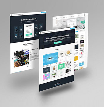
Today, a potential customer may discover your business while using a smartphone, searching Google, checking social media, browsing WhatsApp or looking for a nearby service. If your website is difficult to use on a mobile device, that customer may leave before learning what your business offers.
For businesses in Kandivali East, Kandivali West and surrounding Western Mumbai areas, having a mobile-friendly website is an important part of building a professional online presence.
A mobile-friendly website should do more than simply fit a desktop website onto a smaller screen. It should provide an easy-to-use experience with readable content, accessible navigation, fast-loading pages, clear calls-to-action and convenient enquiry options.
Vipul Pore and Company provides mobile-friendly website design and development solutions for businesses that want websites that work effectively across smartphones, tablets, laptops and desktop computers.
Our approach combines responsive design, mobile-first UX, website performance, SEO-friendly structure and conversion-focused functionality.
Customers increasingly use smartphones to research businesses, products and services.
A customer in Kandivali may search for:
A mobile-friendly website addresses these usability issues by designing the experience around different screen sizes and user behaviours.
Local website providers in Kandivali also commonly emphasise responsive and mobile-first design as part of their website development services.

Our mobile-friendly website services can include:
A mobile-friendly website is designed so that customers can comfortably access and use it on smartphones and other smaller screens.
Important characteristics include:
Responsive design allows website layouts to adapt to different screen sizes.
The same website can provide an appropriate experience on:
Professional service businesses can use mobile websites to make it easy for potential clients to understand their expertise.
Suitable businesses include:
A restaurant website should allow customers to quickly access:
A clinic website should make essential information easy to access.
Potential sections include:
Startups often need a website that creates a strong first impression while remaining flexible for future growth.
A mobile-friendly startup website can include:
Mobile-friendly design and SEO should work together.
A mobile website should allow search engines to access and understand important content.
Mobile SEO considerations can include:
Speed is especially important on mobile devices.
A website may contain:
Structured data can help search engines understand certain information about a business.


Structured data should accurately represent visible information and should not be used to make unsupported claims.

A local citation is a mention of your business information on another website or directory.
Relevant information may include:
We can review relevant business listings to identify inconsistencies and opportunities for improvement.

Genuine reviews can help potential customers understand other people’s experiences with a business.
A local SEO strategy can include a process for:
Businesses should not create fake reviews or misrepresent customer experiences.
The objective should be to build an authentic reputation.

Internal linking helps connect relevant pages across your website.
For example:
This creates a logical website structure and helps visitors discover related services.

Social media can support online growth, but businesses should avoid posting simply for the sake of posting.
Choose platforms based on your audience.
For many businesses, relevant channels may include:
A website should be designed for both visual quality and performance.
Speed optimisation should be based on actual performance data rather than simply claiming that a website is “fast.”

If you are running advertising campaigns, a generic homepage may not always be the best destination.
A dedicated landing page can focus on:
This can provide a more focused customer journey than sending every visitor to the homepage.

SEO can take time to build.
Paid advertising can provide another way to reach potential customers.
Depending on the business, advertising options may include:
Advertising should not be treated simply as paying for traffic.
The quality of the landing page and conversion process matters too.
One of the biggest advantages of digital marketing is the ability to measure activity.
Businesses can monitor metrics such as:
Tracking helps answer an important question:
Which digital activities are actually contributing to business growth?

Before choosing a digital strategy, understand your customer.
Ask:
These answers can influence your website, SEO, advertising and content strategy.
Our mobile-friendly website services can include:
Layouts that adapt to different screen sizes.
User journeys designed with smartphone users in mind.
Development focused on functionality across mobile devices.
Improving technical elements that can affect loading and usability.
Ensuring important content and website functionality remain accessible to search engines and users.
Creating shopping experiences that work effectively on smartphones.
Making calls, WhatsApp and enquiry forms easy to access.
Converting an outdated website into a more responsive and usable experience.
Small businesses often rely heavily on local customers.
A mobile-friendly website can make it easier for potential customers to:
For a local business, these actions can be more important than simply having a visually attractive homepage.
Depending on the actual service area, relevant locations may include:

Navigation is one of the most important parts of mobile UX.
A mobile website should avoid unnecessarily complicated menus.
Depending on the business, the main navigation may include:
The appropriate CTA depends on the business.

Forms designed for desktop users can sometimes become difficult to complete on smartphones.
A mobile-friendly form should consider:
For a simple enquiry, asking for excessive information can create unnecessary friction.

Local customers frequently want to call a business directly.
A mobile-friendly website can include clickable phone numbers and call-to-action buttons.
For example:
A website should be maintained after launch rather than left unattended.
WhatsApp can provide another convenient communication channel.
A mobile website can include a WhatsApp button allowing customers to start a conversation directly.
Potential uses include:
A website should be maintained after launch rather than left unattended.
A customer may discover a product through Google, Instagram or WhatsApp and immediately open the product page on their smartphone.
The mobile shopping journey should make it easy to:
A mobile e-commerce experience should be tested carefully because even small usability issues can interrupt the buying journey.
Retailers can use mobile-friendly websites to showcase their products and provide store information.
A mobile retail website can include:
For businesses with physical stores in Kandivali, the website can connect online discovery with offline visits.








We understand your business, services, customers and actual service area.

We review your website, Google Business Profile and relevant local signals.

We determine what mobile visitors should see and do first.

Mobile layouts, navigation and content hierarchy are developed.

The website is developed using responsive layouts and appropriate technology.

Images, scripts, layouts and other technical elements are reviewed.

Relevant technical and on-page SEO foundations are incorporated.

The website is tested across different screen sizes and common browsers.

After final checks, the website is prepared for launch.

Performance, content and functionality can be improved as the business grows.
Mobile should be considered during the initial design process.
Customers should not need to zoom to read important content.
Buttons should be easy to tap.
Intrusive pop-ups can make mobile navigation difficult.
High-resolution images can significantly affect loading performance.
Only necessary information should be requested.
Phone and WhatsApp options should be easy to find where relevant.
Customers should be able to reach important pages without excessive taps.
For e-commerce websites, checkout should be tested carefully on smartphones.
A website should be designed around the actual behaviour of mobile visitors.
Vipul Pore and Company provides website development and digital solutions for businesses in Mumbai, with its listed office in Borivali West. Vipul Pore and Company
Our services can include:
A mobile-friendly website can be planned together with SEO, local visibility and conversion requirements instead of treating mobile responsiveness as a separate technical feature.
The Kandivali market includes several website development businesses that actively offer responsive, mobile-first and SEO-friendly websites, so a strong project should focus on the actual customer journey and business requirements rather than simply claiming that a website is “mobile-friendly.”
A mobile-friendly website is designed so that customers can comfortably browse, read, navigate and interact with the website using smartphones and other smaller-screen devices.
Customers may discover your business through Google, social media or other channels while using smartphones. A mobile-friendly website makes it easier for them to access information and contact your business.
Responsive design is one of the main techniques used to make a website adapt to different screen sizes. A truly mobile-friendly experience also considers navigation, readability, buttons, forms, performance and the overall user journey.
Yes. Depending on the existing website, it may be possible to optimise the current design or redesign and redevelop the website for a better mobile experience.
Yes. E-commerce websites can be designed around mobile product browsing, search, cart, checkout and payment experiences.
Mobile usability is one component of overall website quality and search performance. SEO also depends on content, relevance, technical structure, authority and many other factors.
Yes. WhatsApp and click-to-call options can be incorporated where they are appropriate for the business.
Yes. WordPress websites can use responsive themes and customised layouts, provided the theme, plugins, content and other technical components are properly configured.
A website should be tested across different screen sizes and devices. You can review usability, loading performance, navigation, forms and other interactive elements rather than relying only on how the site looks on one phone.
The cost depends on whether you need a new website, redesign, custom development, e-commerce functionality, number of pages, integrations, content and other requirements. A project-specific scope is more useful than a single fixed price.
The best evidence of any website development company in Mumbai’s quality is the outcomes their clients achieve. Here is what Mumbai businesses that have worked with Vipul Pore & Co. report – specific, measurable results.

“Our previous website was built by a cheap agency and it took 9 seconds to load on mobile. We were invisible on Google. Vipul Pore rebuilt the entire site from scratch - custom design, clean code, sub-1.8 second load time. Within 4 months we were ranking on page 1 for three of our target keywords and our enquiry rate had doubled.”

“I had spoken to five web agencies in Mumbai before Vipul. Every one of them showed me templates and quoted me vague timelines. Vipul personally walked me through the entire architecture of what we were building, gave me a fixed price, and delivered 3 days ahead of the timeline. The website is exactly what I imagined - and it converts at a rate my competitors would envy.”

“We needed a complex booking and customer portal system for our wellness centres across Mumbai. Vipul Pore & Co. was the only web development company we spoke to that truly understood what we needed technically. They built the entire system in 14 weeks - booking engine, customer accounts, staff scheduling, and payments. It replaced three separate tools we were paying for.”

“Vipul Pore built our first ecommerce website five years ago. Since then he has rebuilt it once, migrated it to Shopify Plus, launched two international markets, and manages our ongoing maintenance. When you find a web development partner who genuinely understands your business, you do not look anywhere else.”
Your customers should not have to struggle to use your website.
A strong mobile-friendly website should make it easy to:
Discover → Understand → Navigate → Enquire → Call → WhatsApp → Buy
Whether you are launching a new business website, redesigning an outdated website or developing an online store, mobile usability should be part of the project from the beginning.
For businesses in Kandivali East, Kandivali West and surrounding Western Mumbai areas, Vipul Pore and Company can help develop a website that combines responsive design, mobile usability, SEO-friendly structure and business-focused functionality.
Contact Vipul Pore and Company to discuss your mobile-friendly website development requirements in Kandivali.




UI/UX Designer & Front End Developer from Mumbai, India.Top-rated freelance web designer on Google and across other platforms