
In 2026, your website is no longer judged by how it looks on a desktop screen. It is judged by how it performs on a smartphone.
More than ever before, users discover brands, browse products, compare services, and complete purchases directly from their mobile devices. If your website is not optimized for mobile – or worse, if it feels like a “shrunk desktop version” – you are losing traffic, leads, and revenue every single day.
Mobile-first design is no longer optional. It is the standard.
Mobile-First Design

Mobile-First Design In 2026, your website is no longer judged by how it looks on a desktop screen. It is judged by how it performs on a smartphone. More than ever before, users discover brands, browse products, compare services, and complete purchases directly from their mobile devices. If your website is not optimized for mobile – or worse, if it feels like a “shrunk desktop version” – you are losing traffic, leads, and revenue every single day. our work. Mobile-first design is no longer optional. It is the standard.
What Is Mobile-First Design?
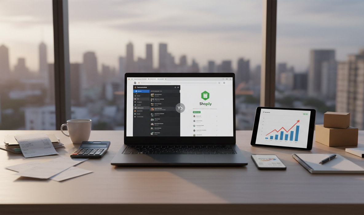
- Clean layout
- Fast loading speed
- Simplified navigation
- Thumb-friendly interaction
- Essential content first
1. Mobile Traffic Dominates in 2026
Today, the majority of website traffic comes from smartphones. Social media, ads, messaging apps, and search engines all drive users to websites through mobile devices first.
If your site looks average on desktop but exceptional on mobile, you win.
If it looks great on desktop but cluttered or slow on mobile, you lose.
User behavior has shifted permanently.
2. Google Uses Mobile-First Indexing
- Mobile speed affects SEO
- Mobile usability affects rankings
- Mobile content structure affects indexing
3. Mobile Users Have Shorter Attention Spans
- Load in under 3 seconds
- Display clear headlines immediately
- Have visible call-to-action buttons
- Avoid cluttered layouts
4. Mobile Design Impacts Conversions Directly
- Accidental clicks
- Hard-to-fill forms
- Small unreadable text
- Checkout frustration
- Increases engagement
- Improves time on site
- Boosts lead generation
- Reduces cart abandonment
5. Social Media Drives Mobile-First Visitors
- They expect fast loading
- They expect vertical-friendly design
- They expect smooth scrolling
- They expect instant clarity
6. Mobile-First Design Improves Brand Perception
A smooth mobile experience feels modern, professional, and trustworthy.
A poorly optimized mobile site feels outdated and unprofessional.
First impressions matter – and today, that first impression almost always happens on a phone screen.
7. Key Elements of a Strong Mobile-First Website
To ensure your website performs better on mobile than desktop, focus on:
Clean Layout
Minimal sections, focused messaging, no unnecessary distractions.
Large, Clear CTAs
Buttons must be easy to tap with a thumb.
Optimized Images
Compressed and responsive visuals to maintain speed.
Simple Navigation
Collapsible menus and intuitive structure.
Fast Checkout (For Ecommerce)
Short forms, auto-fill, guest checkout, and multiple payment options.
The Shift in Design Philosophy
In the past:
Design started with desktop → then adapted to mobile.
In 2026:
Design starts with mobile → then expands to desktop.
- Faster development
- Better user focus
- Stronger SEO foundation
- Higher conversion rates
The Business Impact
- Higher search rankings
- Better engagement rates
- Increased lead generation
- Stronger brand credibility
- Higher sales conversions
Final Thoughts
Your website must not just “work” on mobile. It must perform better on mobile than on desktop.
In 2026, the phone screen is your primary storefront. If your mobile design is slow, cluttered, or confusing, your competitors are only one tap away.
Mobile-first design is not a trend. It is the foundation of modern digital success.
If your website still prioritizes desktop over mobile, it’s time to rethink your strategy – because in today’s digital world, the smallest screen delivers the biggest results.